
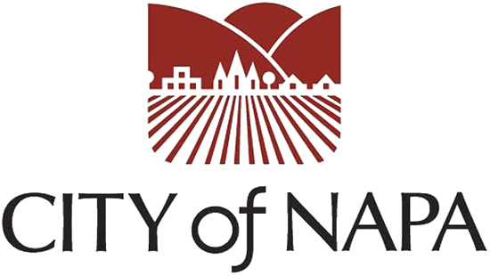
Napa's new logo
on the web at: https://sodacanyonroad.org/forum.php?p=910
Bill Hocker | Jul 1, 2015NVR 6/10/14: Wanting an improved image, Napa will change logo (lots of comments)
The article above is a very old piece of news, but seeing the new logo for the first time today I had to weigh in.
I am alway a bit mystified when someone feels a need to redesign a well-known logo. The logo's purpose is brand recognition - it's costly to rebuild that recognition; sometimes it never gets rebuilt. Was there a purpose in getting rid of Mobil's flying red horse? I'm not sure what their logo looks like now. (Of course being the most profitable corporation on earth they may not care what their logo looks like. But they may not have become so profitable without the horse.)
Anyway, the city of Napa has a new logo and I again ask myself why. It's on the left next to the old logo. The old one is technically more accurate since most of the vineyards within the city limits are flat. I like the memorable use of the 2 typefaces in the title of the old one as well. And the restraint in the use of color. I don't quite see the point to the change other than to remove the church from the center of town life. Perhaps that was it - a church-state concern. And I don't think the new one carries an appropriate air of governmental authority - not that I'm into governmental authority.
 |  |
When I heard about the change last year I decided to make my own proposal. I never submitted it - I don't know why. It was certainly a better reflection of the changes going on in the city. Maybe I should have eliminated the church.

copyright © sodacanyonroad.org